Tuesday, October 16, 2012

Alex Paik at Gallery Joe

Alex Paik: Prelude and Fugue

Installation view of paper wall sculptures by Alex Paik
Installation view of Alex Paik at Gallery Joe,
From Two Coats of Paint
Alex Paik's suite of works made with cut paper, gouache, and colored pencil, Prelude and Fugue, is currently on display at Gallery Joe.  Paik is one of the founders of the art space in Philadelphia Tiger Strikes Asteroid.  This is his first solo show at Gallery Joe and is entitled Recapitulation Bop.  It will be on display until November 10th.
Alex Paik, 2012, Prelude and Fugue (Airy)
Alex Paik, 2012, Prelude and Fugue (Bars)
According to Sharon Butler at Two Coats of Paint, Paik is also opening a new branch of Tiger Strikes Asteroid in Bushwick in November.

Wednesday, October 10, 2012

Richard Bottwin's Wall Sculptures

Richard Bottwin

Richard Bottwin Wall Sculpture
Parallel #1, 2006, 14" x  8.5" x  9"
Macassar Ebony on Birch Plywood, Acrylic Paint
from richardbottwin.com
I recently read the article A few highlights from the 2012 DUMBO Arts Festival on Two Coats of Paint which introduced me to the art of Richard Bottwin.  His wall sculptures are fresh takes on motifs from modernist painting/reductive abstraction.  His works are strictly non-objective, emphasizing color and form but lacking the dogmatic Greenbergian trait of flatness which suspiciously speaks to the essence of the business aspect of art rather than the "essence of a painting" (A flat painting can be mass produced as a commodity).  Also, rather than the pieces being strictly autonomous and fixed from any vantage point, the perspective of the viewer plays a key role in experiencing the piece.
Richard Bottwin Wall Sculpture
Profile #2, 2008 16" x 13.5" x 13"
Acrylic Color and Zebrawood Veneer on Birch Plywood
Vantage Point #1, from richardbottwin.com
"The surfaces, laminated with wood veneers or painted with acrylic colors, are configured to reveal surprising shapes and patterns with shifts in the viewer's perspective.  A sense of disorientation, implied weightlessness and the element of surprise are created by the reductive forms and subvert the modernist vocabulary of the simple constructions." - Richard Bottwin

Richard Bottwin Wall Sculpture
Profile #2, 2008 16" x 13.5" x 13"
Acrylic Color and Zebrawood Veneer on Birch Plywood
Vantage Point #2, from richardbottwin.com

Sunday, September 23, 2012

Wendy White: Pix Vää

Wendy White at Leo Koenig

Wendy White Painting
Wendy White, 11 Oliver,  Acrylic on canvas PVC and vinyl over metal frame, 2012
The past few years have marked themselves as a major turning point in the career of Wendy White. Pix Vää is White's third solo show of 2012.  She is showing paintings from her "Fotobild" and "PVC" paintings.  Her Fotobild paintings consist of images printed from her cellphone and painted over attached to a section of illegible text.  Although seemingly non-objective paintings, White ties them to specific locations: 11 Oliver refers to a building in NYC.  The painting's size allows it to engulf the viewer, and the marks represent traces of human activity (probably from around the building).  

Wendy White Painting
Wendy White, 15 Monroe, Acrylic on Canvas, PVC, 2012
Read more in the article On Top of the Rubble: Recent Work by Wendy White by John Yau.


Vince Hannemann: Cathedral of Junk

Austin's Cathedral of Junk

Picture of Cathedral of Junk
Photo by Blake Gordon of Wall Street Journal
Picture of knuckle tattoos reading: JUNK KING
thisiscolossal.com
Vince Hannemann's fingers read: JUNK KING, but his ongoing project "Cathedral of Junk" in Austin, TX is part of a much larger than autobiographical narrative: "Writing is the destruction of every voice, of every point of origin," writies Roland Barthes in Death of the Author, claiming that the origin and creator of a text, or in this case cathedral remains secondary to the work itself.  This indelible backyard art project which started in 1988 in Austin has already made its mark and left impressions on thousands of visitors, and vice versa: the "junk" that comprises the cathedral is primarily composed of stuff brought from the outside world by its congregation.

freefuninaustin.com
Although 10,000+ visitors come to see his backyard attraction each year Hannemann's personal favorite visitors seem to be children, which is no surprise considering that he clearly emphasizes imaginative thinking and creativity:
[when asked] What made you want to do this?' Like it had some sort of profound meaning. I just did it because I liked it. And when I stop liking it I'll take it down...I just did it because it was kinda cool, It's my clubhouse. It's fun. Kids, when they come through, they know what it is.

Watch this short film by Evan Burns about the Junk Cathedral

The Junk King from Evan Burns on Vimeo.

Friday, September 21, 2012

Deconstructed Paintings: Dianna Molzan

Dianna Molzan

Dianna Molzan's deconstructed paintings probably take most viewers outside of their comfort zone, not bringing attention to either the surface of the work or the image being created, but even further back. The"surfaces" of her deconstructed paintings allow the viewer to simultaneously view the materials and the substrate.  It is hard to see them for anything that they are not, pushing the limits of process/craft oriented art.  The entropic forms created tend to negotiate with the materials used rather than dominating and sublimating them into the world of high art, and this is why the work is successful.

Dianna Molzan Painting


Wednesday, September 5, 2012

Artist Overview: Kaz Oshiro


Kaz Oshiro's Still Lifes

The emergence of Kaz Oshiro's stretched canvas works represents a paradigm shift in the world of still-life painting.  Like Robert Ryman before him, Oshiro's work focuses on the real experience of painting.  Unlike Ryman however, the real experience of painting begins with the construction of the canvas.  The problem is not worked out on the surface of the canvas, but in the three dimensional realm.  The piece below, Untitled Still Life, is exemplary of this approach.  The work is what it is, similar to the approach taken by Isa Genzken in relation to the still-life.
A painting of Kaz Oshiro's
Source: Contempory Art Daily
"I thought that by making an object out of a canvas I’d be able to achieve what I want to do, which is practice making things physically. But at the same time, I wouldn’t have to explain much: it’s a still life sitting on the floor. It’s a painting." -Kaz Oshiro, Kaz Oshiro's "Painting Problem"

Simulacram

Source: Yvon Lambert
The majority Oshiro's work can be seen as simulacra of everyday objects.  His paintings remain humble; his goal is not to transform the found object into an art object.  Inversely, Oshiro takes the elevated status of Pollock's canvas and quietly places it back on the ground, so to speak.  He uses traditional objects from the realm of painting (stretchers, canvas, and paint) and transforms them into what reads at first glance as an everyday object.  After closer inspection though, the viewer realizes that it the object is a hyperrealistic three-dimensional representation of that object. 

an installation by Kaz Oshiro
Source:  http://artsceneseen.tumblr.com
The image that is painted on each two dimensional surface is exactly that: a duplication of the surface being represented (which could stand alone as an abstract painting). It is only in the greater context that the illusion is created: Oshiro's works are "real illusions."  If each canvas was placed alone on a wall all that would remain would be a weak attempt at capturing the sublime.  Gestalt: the whole is greater than the sum of its parts.
Source: Galerie Perrotin

Saturday, August 18, 2012

Artist Overview: Amanda Valdez

Amanda Valdez

Recently acquiring her MFA at Hunter College, Amanda Valdez is an artist based in New York City.  Valdez is primarily an abstract painter who employs fabric, sewing, and yarn in her process, along with occasional silkscreening.

Untitled (Temple One), 2010.
Fabric and Canvas
12" x 12"

Grid Paintings

Grid paintings come a dime a dozen, but Valdez's grids use a process that is unparalleled.  Sewing fabric to canvas, the forms created by the fabric are literally integral in the object itself, rather then buying a ready-made canvas.  This also exposes the objecthood, the reality of paint, as well as the object-hood of the canvas itself, rather than denying this element and rendering what is purely an image. This object/image dialogue is reoccurring throughout Valdez's paintings.

The painting Untitled (Temple One), is divided into five larger horizontal strips of canvas that are subdivided into messy rhomboids of disparate fabrics.  The lattice, which is made up by sewn stitches is an organic, quivering line which is clearly intentional.  These irregular lines, in addition to the alternation of light and dark colors give the viewer a sense of depth and three-dimensionality in.  However, some cells resist that by bringing the viewer back to the surface of the image.  The quivering line lattice and the balance of depth and flatness in this grid, as well as the few color anomalies seem to make the painting as a whole not necessarily read as a grid, but an image of stacked objects with a sense of gravity (which seems intentional considering the title).
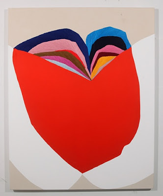
Abstract art by Amanda Valdez.  Made from yarn and acrylic paint
Dwells Among Us,  2011.
Embroidery, Fabric, Gesso, and Canvas
48" x 36"

Abstract Paintings

Amanda Valdez's painting Dwells Among Us.  The forms seem to walk on the edge of color-field paintings and geometric abstraction.   As you can see in the detail (below), the two arcs in the upper portion of the canvas consist of multi-colored strands of yarn which are heavily affected by lighting when the viewer navigates around it.  This element as well as adding literal depth to canvas, creates a figure-ground play in which the yarn form and the organic red form seem to constantly remain in flux.  This is no small task considering the brilliance of the red form. 

Just as with her grid paintings, the abstract forms of her other paintings remain on the edge of abstraction and representation. The push and pull between bother pictorial depth and literal depth allow the viewer to switch between reading the paintings as objective and non-objective abstraction. However, after reading her studio blog: and there will be trouble, you will find that it more than likely is objective abstraction.  For your viewing pleasure I will leave you with this gift: Amanda Valdez's personal website
Dwells Among Us, 2011.
Detail